 |
|
"Screen"
by Chloe Kline 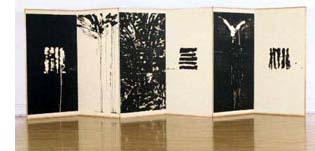 "It's a kind of invitation for nature to play a role," says Sandy Walker, when I ask him about the wood he's chosen - rough grade industrial plywood - to carve for his woodblock prints. "I like the possibility for accident, the roughness, the scarring, the obvious quality of wood in the final piece. I like accepting the accidental nature of the process rather than trying to control it."
It's a philosophy peculiarly appropriate to the subject of Screen, a six-part woodblock print which reflects upon the fundamental essence of nature, the both fluid and inexorable relationship between time and nature, and our complicated relationship to both. (Nature, I should add, accepts Walker's invitation to participate in the work, both in the previously mentioned scarring of the blocks, the clearly visible scraps of mulberry bark in the Japanese Chiri paper, and in the ink's original spontaneity, now fixed in the carving.) Walker conceived the carvings - begun in the summer of 1997 in the remote mountain community of Stehekin, WA, and later carved in his Oakland, CA studio - as a six-panel traditional Japanese screen. Once carved, the images were printed by Romi Sloboda of Red Print Press in Philadelphia in 1998, and finally set onto screens in 2001 by Bonnie Jo Cullison and Richard Smith of Point Richmond, CA. The prints are a study in contrasts: among six panels, three are dark and three light; three are images taken from the natural world, and three are sets of thick, calligraphic lines. The images are suggestive rather than specific, inviting inferences rather than offering direct references. As you experience the images, they seem to undergo a subtle shift from the non-specific to the universal, allowing individual reflection without requiring response. The images are intimate and welcoming - a quality that is heightened when the prints are viewed as a screen. The panels with the calligraphic strokes - intentional allusions on Walker's part to the characters of the I Ching - also imply the language of the natural world. The hexagrams of the I Ching are them-selves built around visual representations of nature, and Walker's images, which suggest the structure of the hexagrams without mimicking them - Walker's images contain only four or five lines - convey the vitality and elemental quality of the symbols. When asked about the contrast between light and dark, Walker has a ready answer. "I've always felt that time was an important element in my work. When we experience a series, we have a tendency to read it, as we do a book . . . so the frontal experience of this piece, with or without the screen as a frame, suggests time. The addition of the screen adds another dimension to this experience: rather than a purely frontal experience, the viewer can also walk past the screen, experiencing the work as only dark, then changing to mixed light and dark, and then only light. As your position changes, some parts are blocked and others revealed. At its most elemental, I like to think of that as the passage of time." The most surprising impression one retains from these prints is that of sensuousness. The lithe and flexible lines carry an energy and immediacy that are astonishing in a woodblock print. This seems to be one part memory on the part of the image itself - a recollection of its birth from the inkbrush, as it were. What's extraordinary, however, is Walker's ability to keep this memory alive through countless hours of meticulous hand carving using a traditional Japanese straightedge knife. His lines translate the liquidity and fluidity of ink running down a page through a process that is anything but fluid. There is another explanation for this vitality, which lies in Walker's belief in the creative act as a transmittal of energy and life force from the body to the page. "I think that for me," he begins carefully, "what we refer to as "the hand" is very important, because it is through this that an aliveness and energy is communicated into the artwork. We know it's a drawn line, but we also see the energy coming through the person and into the art. You can refer to this as vibrations, or reverberations . . . it's fundamentally an awareness of that aliveness." This energy offers an interesting challenge during the printing process. "Part of my job," explains Sloboda, whose intimate understanding of Walker's work is the result of collaborative efforts dating back to 1993, "is to make sure that that crispness and immediacy of character - which is very much part of Sandy's work - stays, and doesn't degrade as we're printing the images. That's also why we tend to keep the editions small, so that it's not compromised." Screen was originally planned as an edition of ten, but because of these concerns, Sloboda and Walker decided to limit the run to an edition of five, plus artists' and printers' proofs. Another challenge? Walker's medium of choice. The nature of plywood, which brings happy accidents to the carving technique, can prove treacherous in the printing process. "Plywood by nature is multi-layered," explains Sloboda. "Sometimes, the inner core is not solid, causing the plate to sink in the area where there's no support. But because this imperfection is on the interior, you can't tell if it's a problem until you've started printing. We've been lucky so far not to have a situation where part of the image is endangered by that." To limit stress on the plate, Sloboda inserts maple runners into her press to defect some of the weight of the roller, and covers the plate with chipboard. The final stage, mounting the images as a screen, proved more complex than Walker had expected. After a long search, he was eventually referred to Cullison, a conservator of Asian paintings, and Smith, an artist and woodworker, both of whom had prior experience working with traditional Japanese screens. Initially, Cullison and Smith discussed using traditional screen mounting methods, a labor-intensive process that involved building a lattice work core from small strips of wood, and then covering the core with seven layers of Japanese paper. When the cost of this method became prohibitive, the two came up with an alternate plan. Cullison and Smith used Py-Core, a honeycombed panel material made specifically for mounting fine art. Py-Core has the advantage of being both dimensionally stable, and archivally sound. The panels were cut to size and then framed with thin strips of wood, a technique that allows Smith and Cullison to mount the prints to the panel, and later to attach the outer wood frame to the core. Cullison and Smith mounted the prints as three two-paneled screens (another modification from the original plan, which called for a single, six-paneled screen). Each set of panels is joined with six traditional Japanese hinges, constructed of strong, long-fiber paper. The hinges are hidden once the prints are mounted, but their design allows the panels to fold in either direction - permitting each pair of prints to approach each other or face in opposite directions. Because it would not have been possible to hide the hinges on the base, Smith increased the rigidity of the base, allowing each part to move with the screen without being hinged to the other part of the base. After mastering initial reservations about the addition of a two-foot base to increase the height of the screen, Cullison and Smith designed a minimal, wooden base (influenced by Japanese shoji design, in which a wooden grid is backed with rice paper) to complement the simplicity of the prints. Their first priority, adds Cullison, was not to distract from the focal point of the screens. The result is something more than this "first do no harm" doctrine would imply - there is a subtle correspondence between the shoji grid and the straight-lined panels that suggests that nature, once again, has added its own touch. Cullison agrees that the end result was a pleasant surprise (though she adds that they plan to mount the next set of prints without a base). It's a startlingly involved process when you start to add the hours of work - from the meticulous carving to the long careful printing process to the months of mounting - but the end result is a wonderfully vital and animate work, a piece that hovers between light and dark, East and West, time and timelessness, positive and negative. Chloe Kline
| |||||||||||||||||||||
| home | news | resume | bibliography | paintings | works on paper | wood block | silkscreen | statements | contact |